Introduction
Have you ever wondered why they changed the Walt Disney Pictures logo throughout the years? Have you wondered what they were? Well, wait no longer! In this blog post, we will explore the different Walt Disney Pictures logos and why and how they were changed, even if they were only changed a tiny bit.
What is Walt Disney Pictures?
Walt Disney Pictures, simply known as Disney or known as Disney Live-Action & Animation, is an American-based film production and distribution studio part of The Walt Disney Studios. It’s not only known for animated feature films, but also live action productions, like Lilo & Stitch (2025) and Snow White (the two newest ones).
Years Covered
History of Logos
1985-2006
1985-1989
In 1985, the first ever Walt Disney Pictures logo was introduced, being shown for the first time ever in the movie “Return to Oz“. On a dark purple/blue gradient backdrop, a shower of light descends from the top of the screen, forming a stylized, segmented castle which is a white/purple gradient with only 6 flags. The segments seem to be spaced farther apart by the time the light reaches the bottom. Through the main gate of the castle, a white ball of light forms then extends out to form the words “Walt Disney” in the familiar corporate “Disney” logo font. The word “PICTURES” fades in underneath, and a white semi-circular line is drawn over the castle to the bottom left.
1990-2006
In 1990, the logo changed for the first time, making the background a darker blue and the castle a lighter blue. In addition to that, the line now stops when it hits the tip of the “W” in “Walt Disney”. In 2002, the logo was altered with a brighter blue tint and the addition of the missing 7th flag. However, this version was only used on Disneytoon Studios produced direct-to-video films.
1995-2007
In 1995, a CGI-customized version of the 1990 variant of the Walt Disney Pictures logo was introduced for Pixar movies. This logo uses a computer-generated model of the castle and lacks the beam of light, instead zooming out from the castle gates. In 2008, this CGI logo was retired in favor of the 2006 variant of the Walt Disney Pictures logo, starting with the movie “WALL-E“.
2000-2006
This one isn’t as big of a logo as it was only used in select live-action films, but in 2000, Disney introduced a new variant of the logo, in which the background is black and a glowing orange beam appeared on the screen and illuminates the words “Walt Disney Pictures”. The light then shines the glowing arch, revealing the castle and fades out in the end (the closing logo is still). Some films it was featured in was “Pirates of the Caribbean: The Curse of the Black Pearl“, “The Chronicles of Narnia: The Lion, the Witch and the Wardrobe“, and “The Kid“.
Typography in These Logos
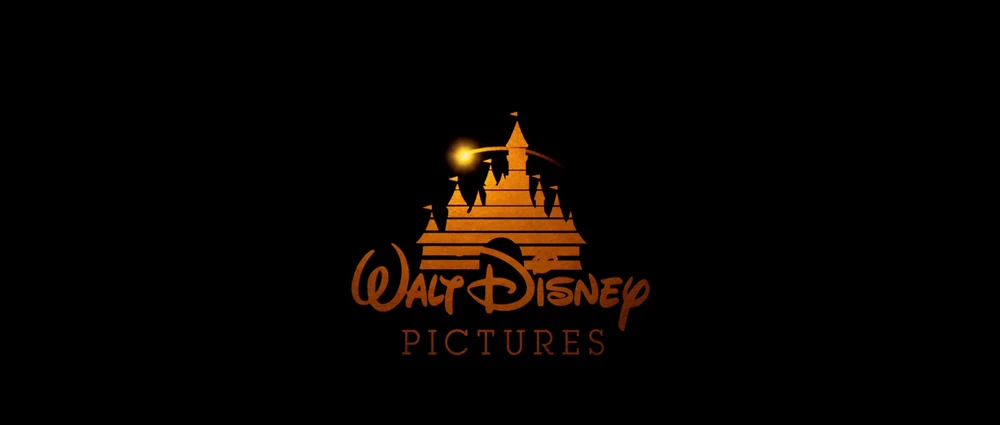
The typography in these logos remain the same throughout the timeline. The typography consists of the “Waltograph” font and the “Lubalin Graph Book” font. The “Walt Disney” part in the logo uses the “Waltograph” font and the “Pictures” part in the logo uses the “Lubalin Graph Book” font.
2006-2022
2006-2011
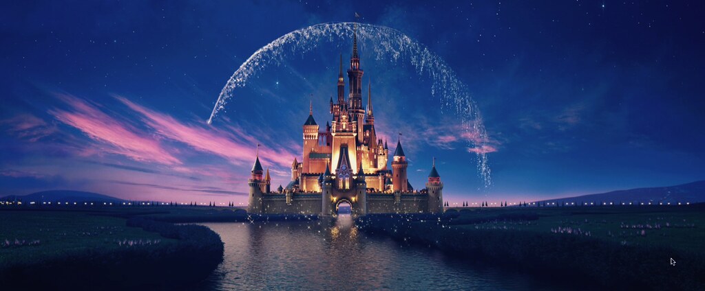
In 2006, starting with “Pirates of the Caribbean: Dead Man’s Chest“, Disney introduced this CGI logo. This opening logo was used until “Treasure Buddies” in 2012. It was also used in tandem with the previous logo until 2007 when Disney fully dropped the “Buena Vista” brand during the release of “Enchanted“. It was also used in Pixar films from “WALL-E” in 2008 to “Lightyear” in 2022, and Walt Disney Animation Studios films from “Meet the Robinsons” in 2007 to “Encanto” in 2021. This logo begins with a glowing star shining in the night sky, while the shiniest star in the right of the sky represents The Second Star to the Right from “Peter Pan“. The view then heads down to what appears to be the Magic Kingdom, complete with a yacht (which is actually Roy E. Disney’s Pyewacket) sailing down a river towards the sea and a train going down a railway track. It then flies over the top of a castle that bears design elements of both Sleeping Beauty Castle and Cinderella Castle, with a flag bearing the Disney family crest, as fireworks go off. Eventually, it settles in front of the castle, in which the glowing arch (like Tinker Bell) flies over it, and the title appears at the bottom. Starting in 2009, the home media opening logo has shortened the text to “Disney”.
2011-2022
In 2011, a new version of the logo was produced based on the 2009 home media logo, which the “Walt Disney Pictures” branding being shortened to “Disney”, with the text being much larger and the color scheme being brighter and more pronounced. It was first shown in “The Muppets” and used until the “Launchpad“ season 2 shorts on September 29, 2023.
Typography in These Logos
The typography in these logos is the exact same as the 1990-2006 logos, with a few differences. Yes, the fonts are the same, but they are more 3D then the 1990-2006 logos. “Waltograph” gets a more 3D look, and so does “Lubalin Graph Book”. In the 2011 variant of the logo, “Pictures” gets completely removed and “Walt Disney” gets shortened to “Disney”. The “Waltograph” font remains there in 2011, though.
2022-present
2022-2024
During the Disney/Pixar film presentation at the 2022 D23 Expo, Disney introduced a new logo to represent the company’s 100th anniversary. The logo made its debut on trailers of “The Little Mermaid“, “Elemental“, and YouTube version trailer of “Hocus Pocus 2” and “Disenchanted“, while the complete logo was shown at the D23 Expo and was unveiled to the public in the D23 Day 1 Recap on Disney+. The logo begins with same night sky from the 2006 logo, but darker and now reflected in a river, then The Second Star to the Right turns into a light and begins to fly through the railway track with a train running and towards a town near the river, and climbs a waterfall at the end of the river. Afterwards, the castle from the previous logo, now modified and platinum-colored, is shown with fireworks forming a Hidden Mickey. Then the castle begins to change to its normal color scheme after it touches pixie dust. As the camera turns around the castle, a pirate ship resembling the Jolly Roger from “Peter Pan” can be seen in the background. A glowing orb now flies off from the river to the castle, and the glowing arch now has a larger radius and is formed from the left side of the castle instead of the right. The text “Disney100” appears drawing on screen, and the slogan for Disney’s 100th anniversary, “100 Years of Wonder” appears underneath it. The slogan, however, made its final apparance on the international theatrical release of “Indiana Jones and the Dial of Destiny“.
2024-present
Beginning with “Inside Out 2“, the entire logo was completely revamped, with major lighting enhancements, adding parts of the landscape and updating the grass, changing some of the windows of the castle, updating the beginning intro with altering the ripple, darkening the text largely, and having the focal length altered. On February 7, 2025, this version made its official Disney+ debut on “The Lion King at the Hollywood Bowl“, albeit as a variant where the logo transitions into the opening of the special. In “Moana 2“, the opening logo fades out early.
Typography in These Logos
The typography in these logos is the same as the 2006-2011, with a few changes in the 2022-2024 logo. In the 2022-2024 logo, the classic “Waltograph” font in 3D returns, in addition to a new font called “Inspire TWDC“. The classic “Disney” text is in the “Waltograph” font, while the number “100” and the slogan “100 Years of Wonder” is in the “Inspire TWDC” font. In 2024, the typography returns to just “Disney” in the “Waltograph” font.
Conclusion
In this blog post, we covered a lot, so let me summarize it for you. Disney has had about 9 different variations of the “Walt Disney Pictures” logo in the past 40 years. The typography has remained the same for the most part, with a few minor changes along the way. The intro that pairs along with the logo has also changed majorly, and sometimes minorly, along the way. I hope you enjoyed reading!